Box-sizing CSS property
31-05-22 02:44 PM By Senan
- What is it?
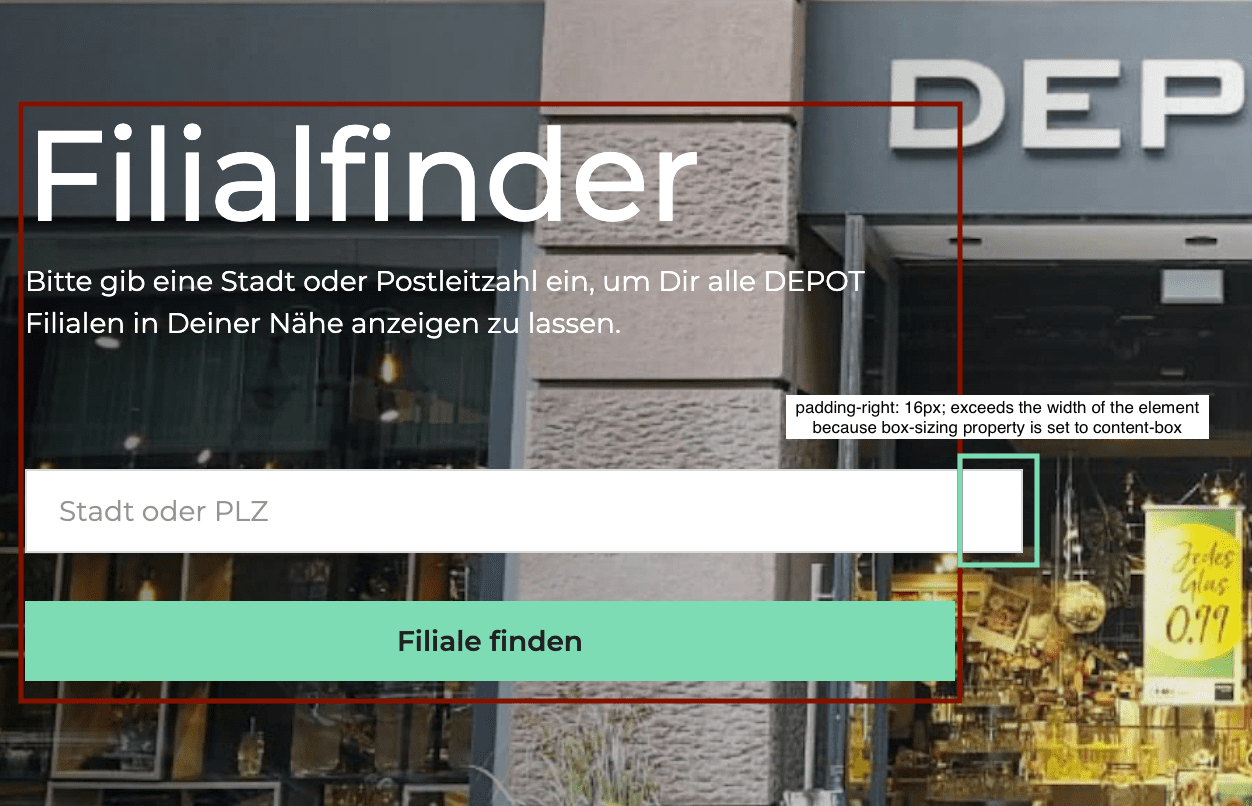
- A CSS property that tells the browser how to calculate the total width and height of an element.
- How does it normally behave?
- The default box-sizing behavior is the content-box.
- If you were to set an element’s width to 100px, then the content-box width will be 100px.
- Say you want to add padding-left: 7px. This value will be added to the width of the content-box, making the final rendered width 107px.
- In what case would I need to use it?
- Let’s say that for example, you have four divs each has width: 25%; of the parent container.
- You decide that you want to add a border or padding to anyone of the divs, what happens?
- They will no longer fit on one line, because now their total rendered width is more than that of the parent container, so what should you do now?
- This is where the box-sizing property comes in.
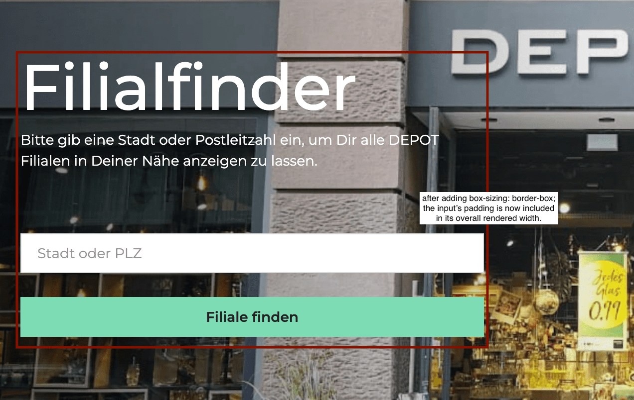
- You simply set the property value to box-sizing, which then tells the browser that any added border or padding will be included in the total width of the element.
- Let’s take a look at a live example:
- In picture number one, you can see that the width of the input exceeds the defined width of the div. This is because the default box-sizing behavior for this specific angular material component, is set to content-box.